You finally found a home feature you love — maybe it’s an open floor plan, a farmhouse sink, or those trendy barn doors. But did you know architects might be silently cringing every time they see it?
It turns out, some of the most popular home features buyers go crazy for are actually not that great in an architect’s eyes. Curious what made the list? You might be surprised by a few of these!
1.) Open Concept Floor Plans

Open concept floor plans are a huge selling point for buyers who want that airy, connected feel. No walls between the kitchen, living room, and dining area sounds like a dream — until you realize every smell, sound, and mess is shared with the whole house.
Architects often point out that removing those walls can also create heating and cooling headaches, since open spaces are harder to climate control. It looks great in photos, but living in it is a different story.
2.) Shiplap Accent Walls
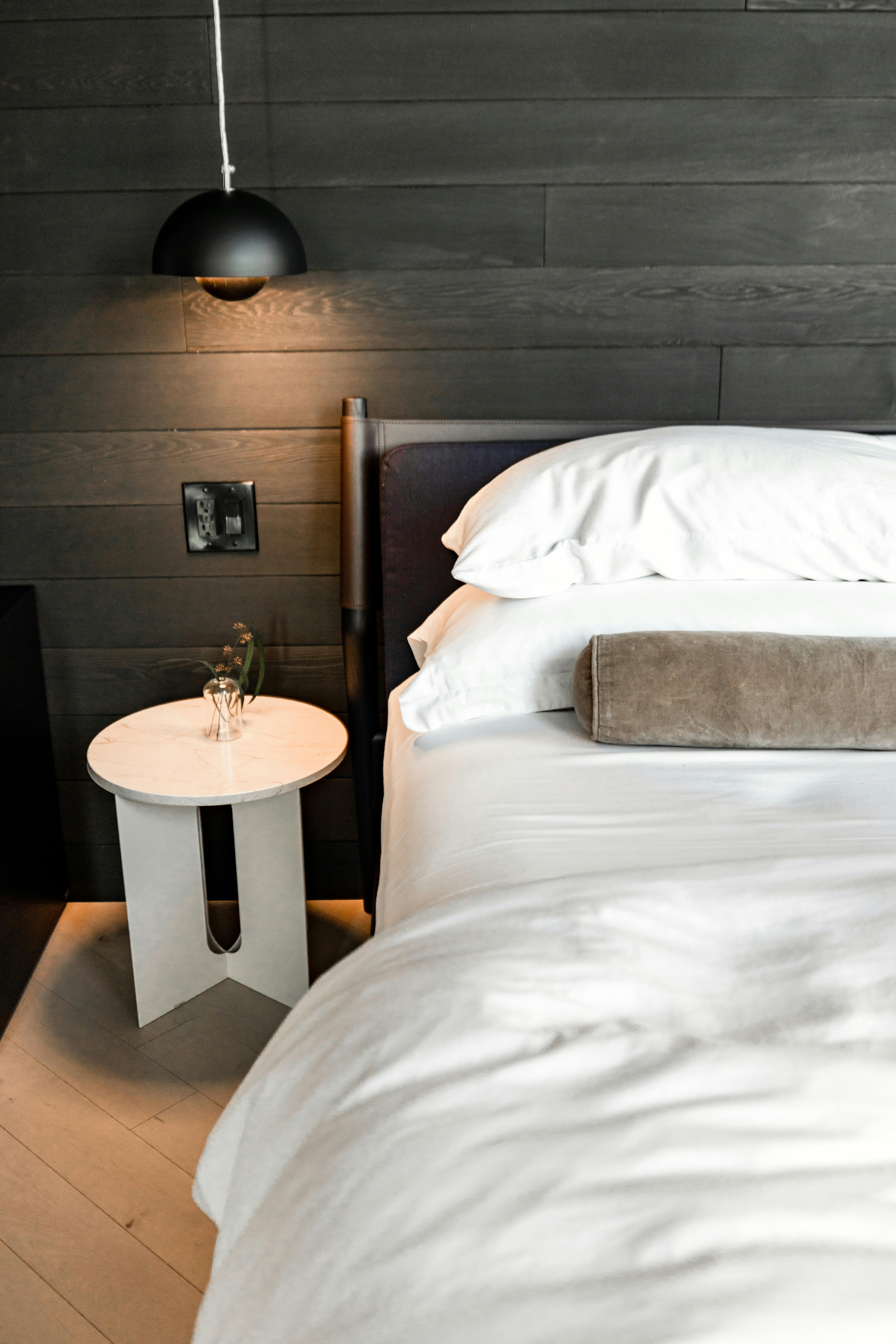
Shiplap walls got really popular thanks to home renovation shows, and buyers still go crazy for them. The look works best in living rooms or bedrooms where it can add some texture without feeling overdone.
Here’s the thing, though — architects tend to roll their eyes a little. Shiplap can trap dust, isn’t always easy to paint over, and sometimes feels more “trend” than “timeless.” If you love it, go for it, but keep it to one wall so it doesn’t overwhelm the space.
3.) Barn Doors
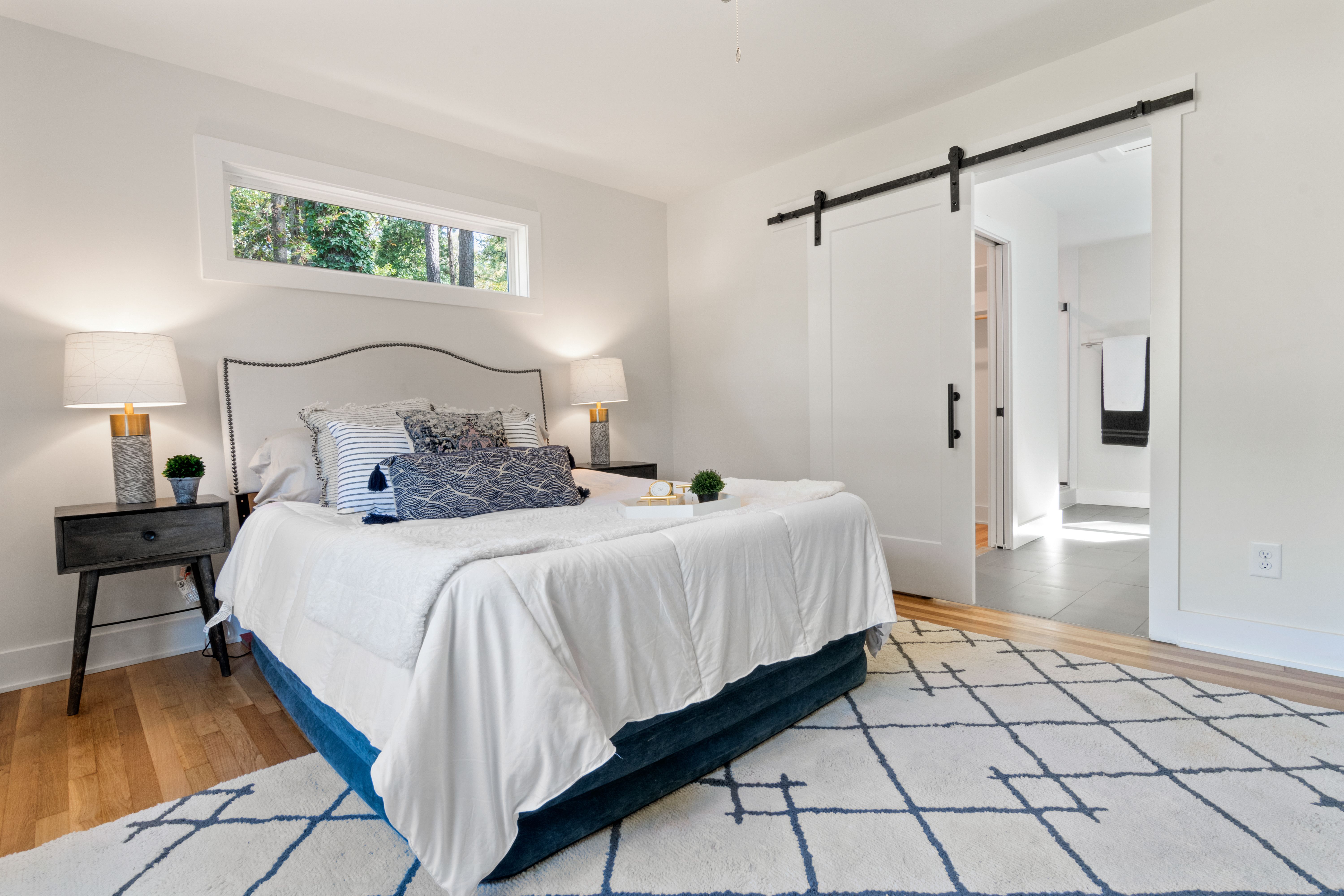
Barn doors are a big trend in home design, especially for bedrooms, bathrooms, and home offices. Buyers love the rustic look and the space-saving setup since they slide instead of swing open.
Here’s the thing, though — architects aren’t always fans. The gaps around the edges mean zero sound blocking and very little privacy. They also need clear wall space to slide into, which limits furniture placement more than people realize before they buy.
4.) Granite Countertops
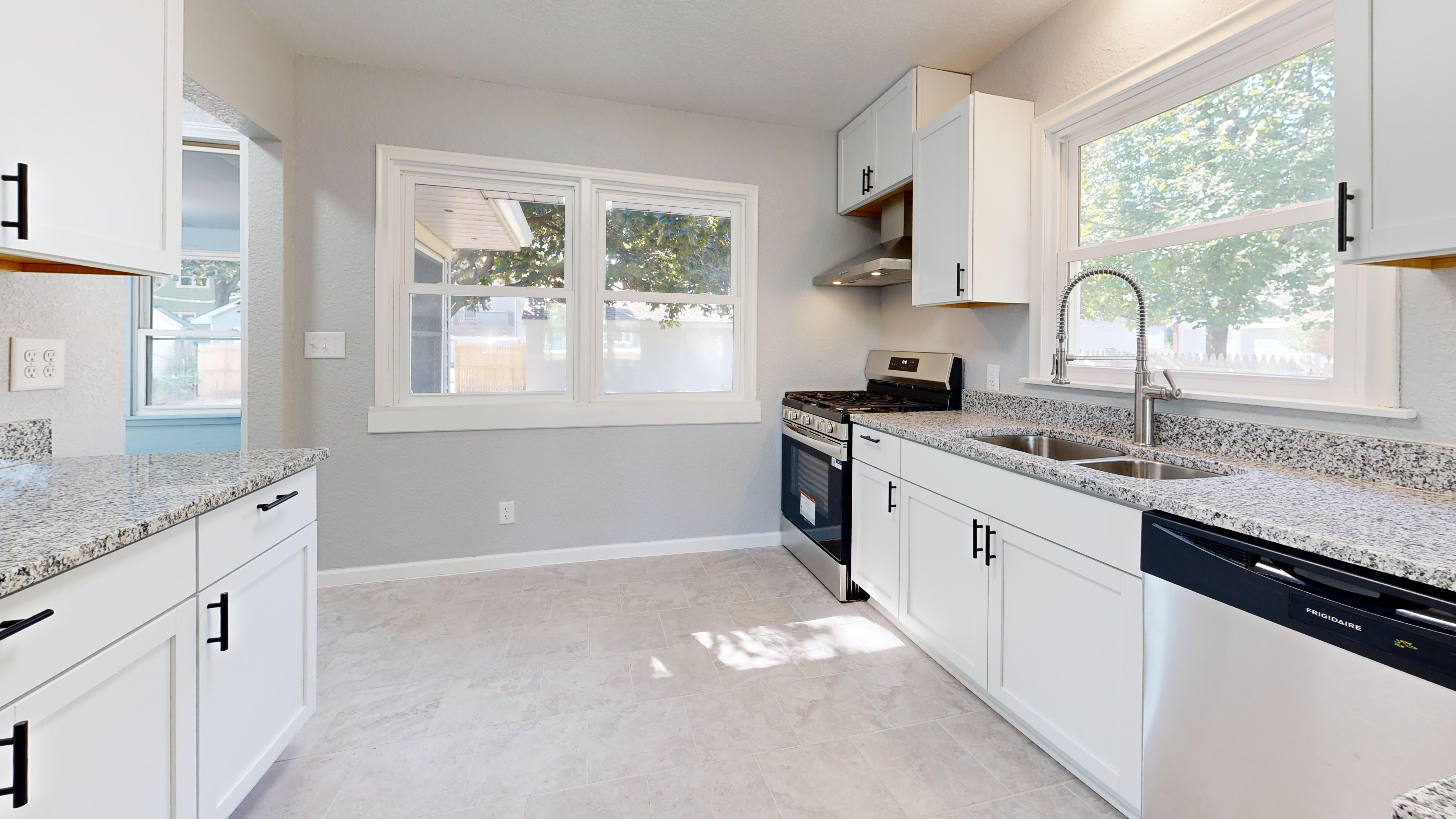
Granite countertops have been a selling point in kitchens for decades, but architects tend to raise an eyebrow at them. They’re heavy, they need regular sealing, and the busy patterns can make a kitchen feel cluttered rather than clean.
That said, they do hold up well to heat and scratches, so they’re not all bad. If you love the look, go for a simpler, more uniform slab instead of something with a lot of movement in the pattern.
5.) Oversized Kitchen Islands
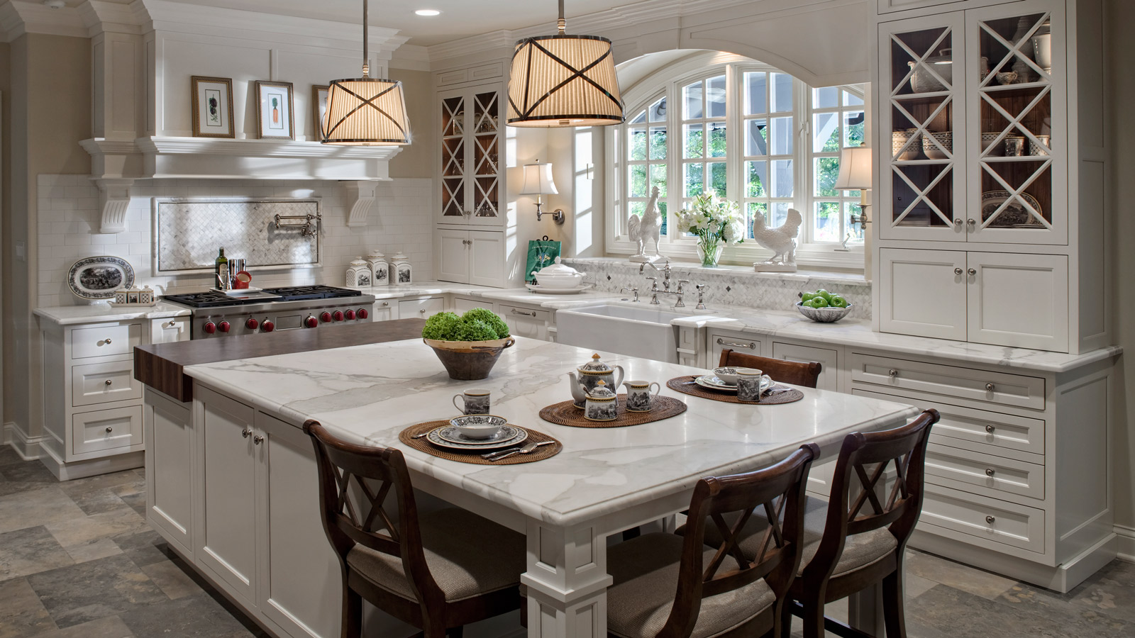
Buyers go wild for a massive kitchen island, and honestly, it’s easy to see why — extra prep space, extra seating, extra storage. What’s not to love?
Architects, though, will quietly notice if that island is too big for the room. If people have to squeeze past it to reach the stove or fridge, the kitchen stops working the way it should.
A good rule of thumb is leaving at least 42 inches of clearance on all sides.
6.) Carpet in Bathrooms
Carpet in the bathroom might feel cozy underfoot, but architects tend to cringe at the sight of it. The mix of moisture, humidity, and daily splashes makes carpet a breeding ground for mold and mildew — and once it sets in, it’s nearly impossible to fully clean.
If you love the soft feeling, try a washable bath mat instead. You get the comfort without trapping moisture in fibers that sit on your floor 24/7.
7.) Fake Wood Beams

Fake wood beams are a popular pick for buyers who want that rustic, cozy ceiling look without the cost of real timber. They show up a lot in living rooms and kitchens, and plenty of homeowners love how they add character to a plain space.
Architects, though? They tend to notice when the scale is off or the beams are placed without any structural logic. A beam that’s too small, too spaced out, or just floating randomly on a ceiling can look a little off to a trained eye.
8.) Chandelier Over Bathtub
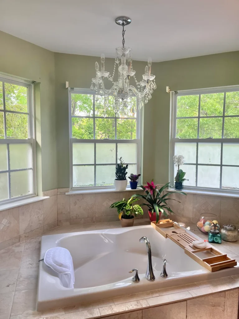
A chandelier hanging over a freestanding tub looks straight out of a luxury hotel, and buyers genuinely love it. It feels fancy, a little dramatic, and like something out of a design magazine.
Here’s the thing, though — architects tend to wince. Bathrooms have strict electrical codes about fixtures near water, so placement matters a lot. Many chandeliers sold for this look aren’t actually rated for damp or wet zones, which creates a real safety issue most homeowners don’t think about until it’s too late.
9.) Too Many Recessed Lights

More recessed lights does not equal better lighting. Architects tend to cringe when they see a grid of a dozen can lights across a ceiling — it ends up feeling flat and a little cold, like a doctor’s office.
A better approach is to layer your lighting with a mix of pendants, sconces, and floor lamps. Recessed lights work well as accents or task lighting, not as the only source. A few placed thoughtfully will always beat a ceiling full of holes.
10.) All-White Minimalist Kitchens

All-white kitchens look clean and open in listing photos, which is exactly why buyers keep requesting them. But architects will quietly tell you they’re a bit of a headache in real life.
Every scuff, stain, and fingerprint shows up immediately. Grout lines turn gray fast, and that bright white can feel cold and flat without the right lighting. If you love the look, try warming it up with wood accents or mixed textures so it doesn’t feel like a hospital break room.
11.) Mismatched Window Styles

Buyers often love the look of mixing window shapes — a big picture window here, an arched one there. It can feel unique and full of character. But architects? They’re quietly cringing.
The problem is that mismatched windows can mess with a home’s visual balance from the outside. It can look unplanned rather than intentional. It also makes future replacements trickier and pricier.
If you want variety, architects suggest sticking to one consistent style and varying only the size for a cleaner, more cohesive look.
12.) Excessive Crown Molding

Crown molding can look really sharp in older, traditional homes where the ceilings are tall and the style calls for it. But pile it on in a modern or mid-century home, and it starts to feel a little off — like wearing a tuxedo to a backyard cookout.
Architects tend to cringe when they see thick, ornate molding crammed into rooms with low ceilings. It actually makes the space feel smaller and busier. Sometimes less really is more.
13.) Stone Veneer Exteriors
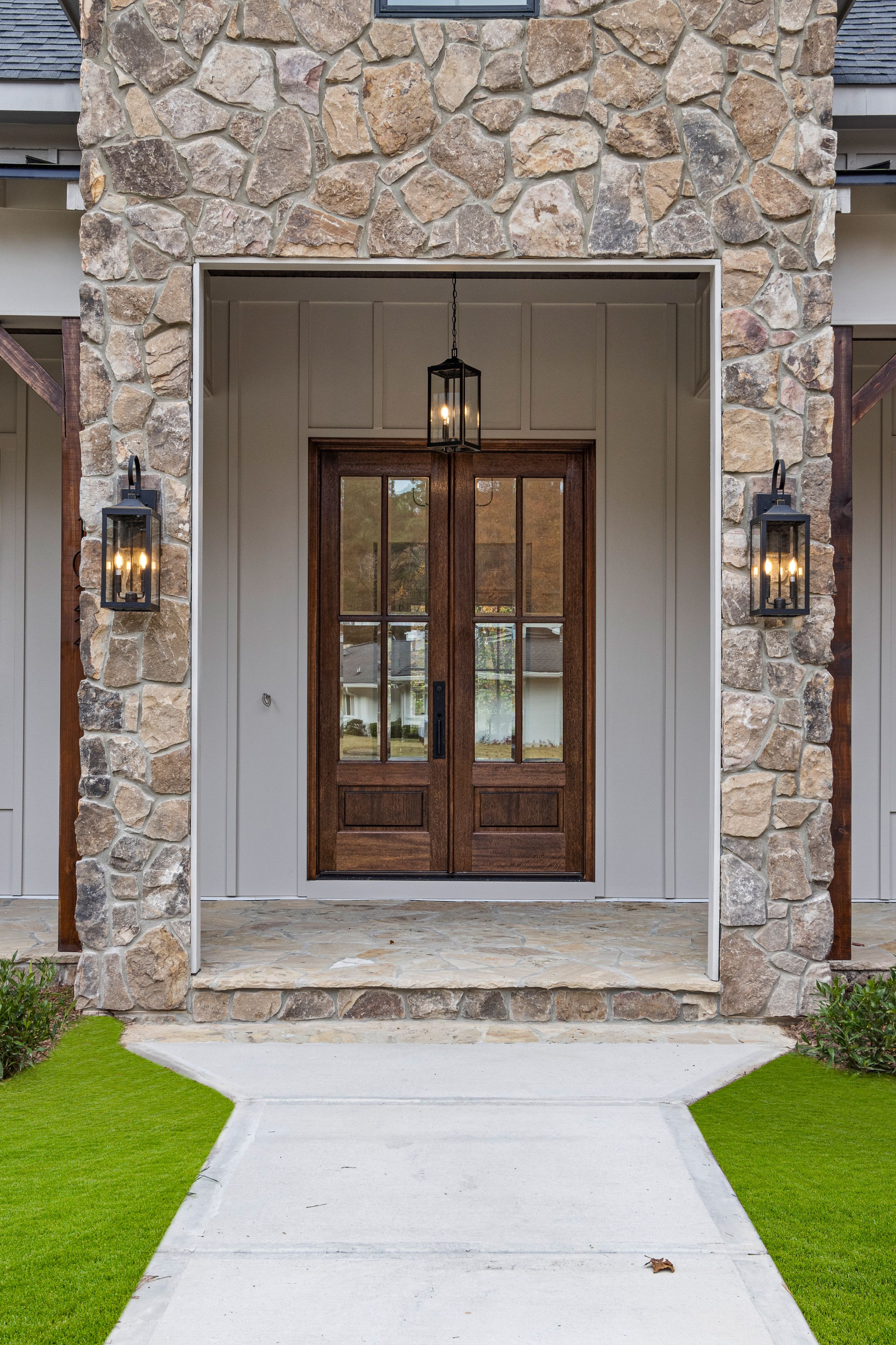
Stone veneer on the outside of a home is a popular selling point, and buyers tend to love the way it looks. It gives off a solid, expensive feel without the cost of real stone.
But architects often have mixed feelings about it. If it’s not installed correctly, water can sneak behind the panels and cause serious damage over time.
When it’s done well, it can work. When it’s slapped on just for looks, professionals usually notice — and not in a good way.
14.) McMansion Facades

Buyers often love the look of a McMansion — that big, impressive front with columns, arched windows, and fancy brickwork slapped onto a relatively basic house. It feels grand from the street, and that curb appeal is a real selling point.
But architects notice pretty quickly when the outside doesn’t match the inside. Mismatched materials, decorative details that serve no purpose, and facades that feel more like a costume than real design tend to stand out — and not in a good way.
15.) Trendy Accent Wall Colors

Accent walls in deep greens, moody blues, or terracotta are everywhere right now, and buyers tend to get excited about them during home tours. But architects often cringe a little, mostly because bold wall colors can feel dated faster than people expect.
If you love the look, stick to muted, earthy tones rather than anything too trendy. And make sure the color actually works with your natural light — what looks great in photos can feel pretty heavy in a darker room.